FabFilter reimagined: 3D Art and website transformation
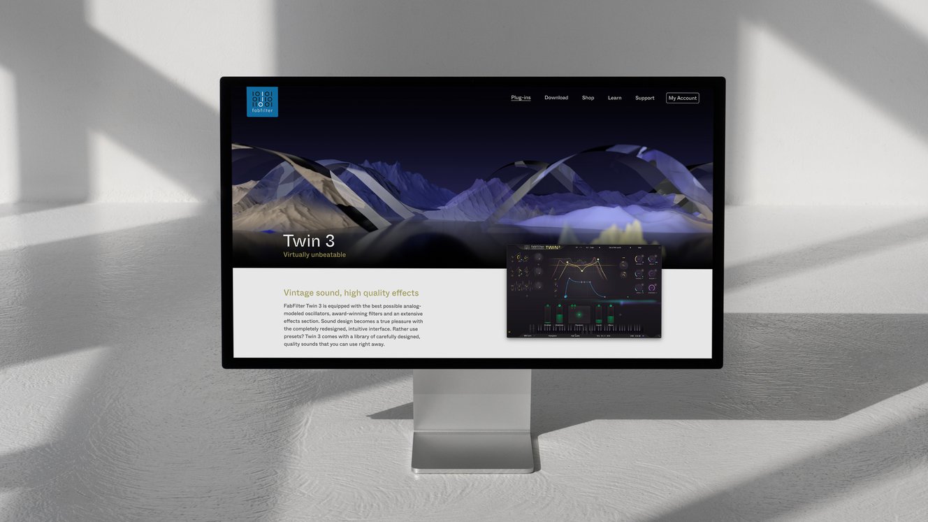
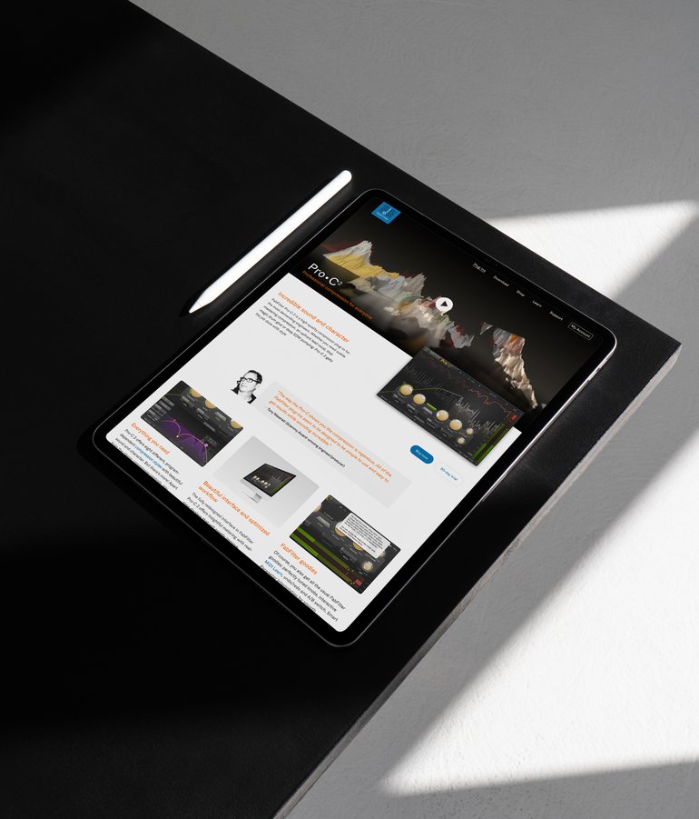
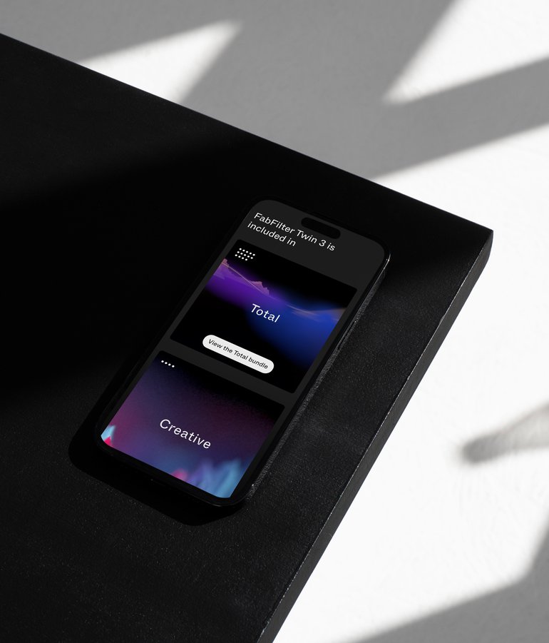
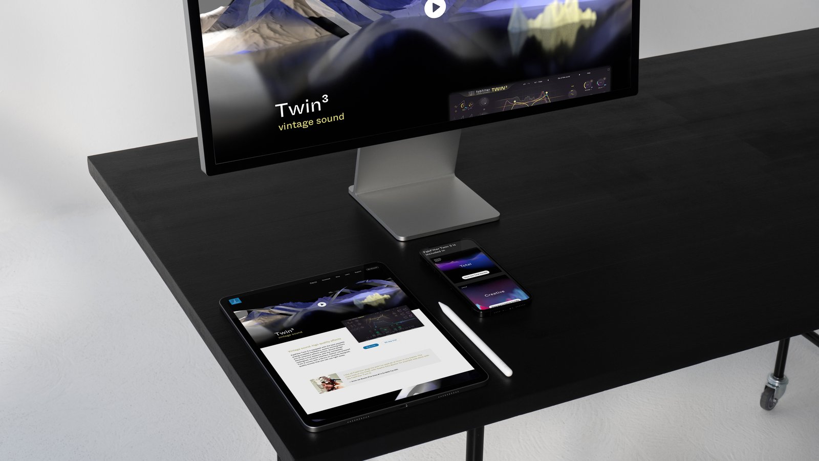
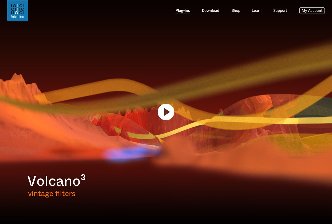
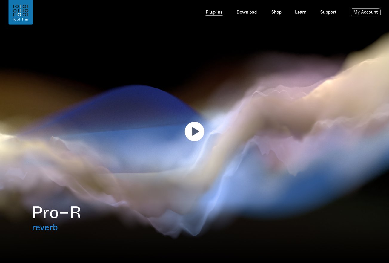
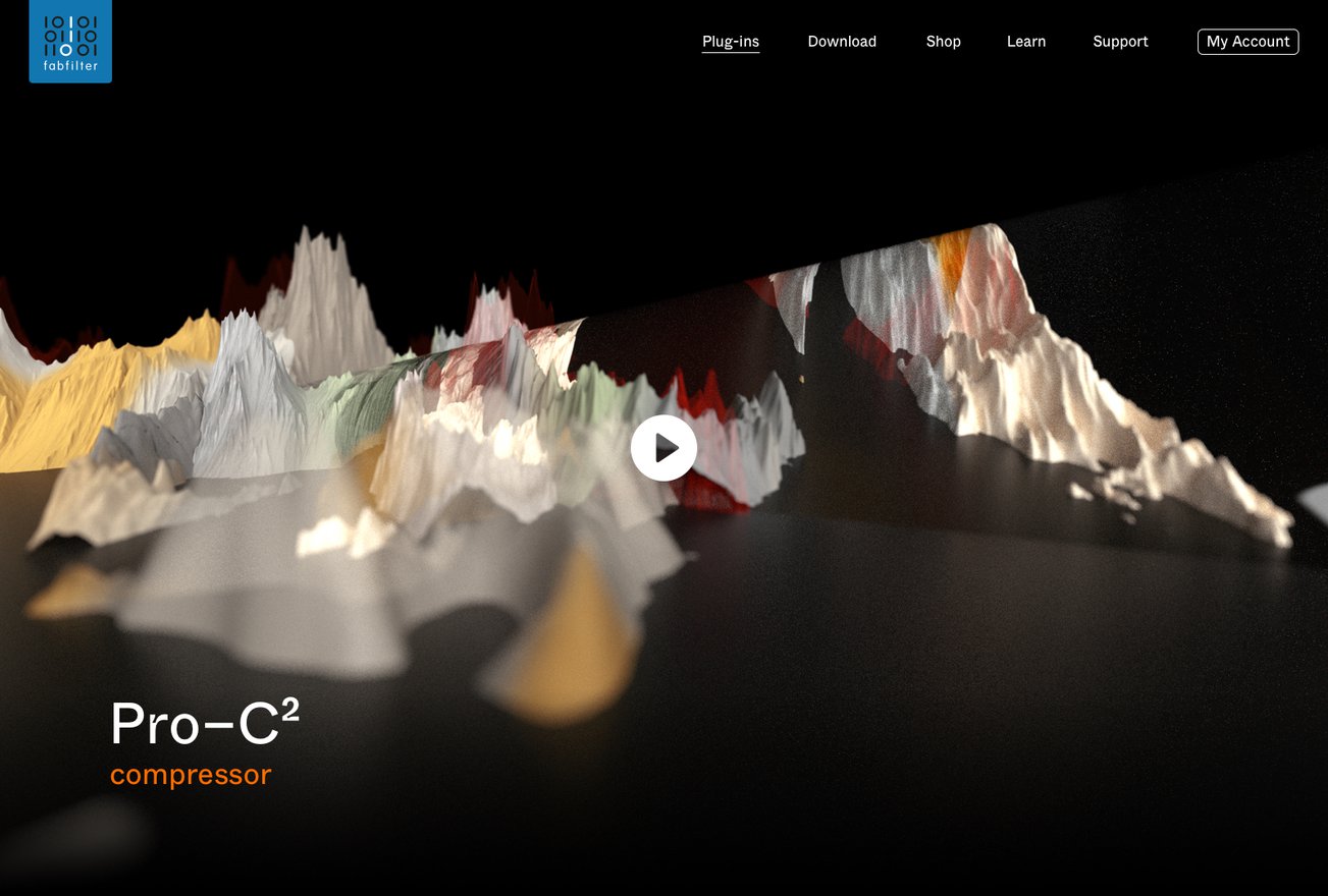
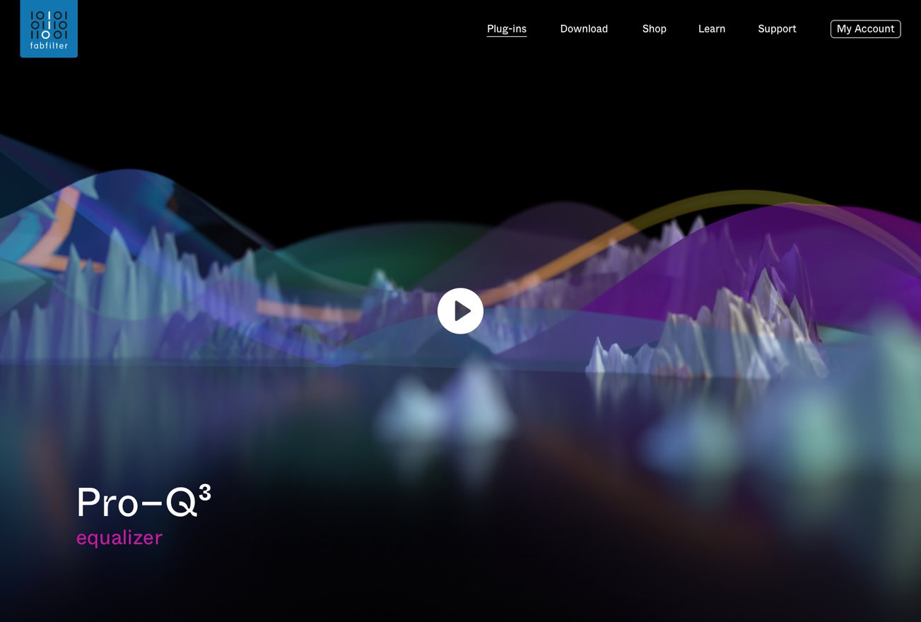
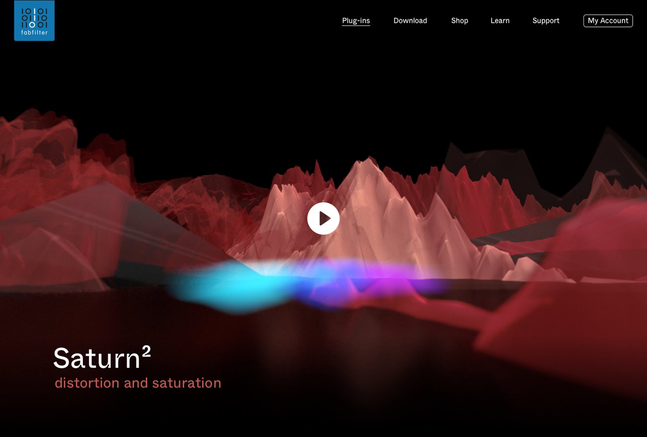
We're excited to share our creative journey with FabFilter. These guys make the best possible tools for music production and audio processing. Our goal was to refresh FabFilter's look and feel to capture the spirit of their audio plug-ins, and we did it in a unique way. One of the most captivating elements of the concept are the abstract 3D landscapes we created. Each one is tailored to the unique character of FabFilter's audio plug-ins.
Read more
Drawing inspiration from the auditory and visual nuances of each tool, these landscapes became a visual symphony, translating soundwaves into breathtaking visual art. Just like their plug-ins, these extraordinary landscapes let your senses become one with the music.
We started by giving the FabFilter branding a fresh twist. We introduced the Whyte font which has lovely ink traps. It reflects the energy and innovation that their audio tools bring to music. But we didn't stop at visual aesthetics. We designed and developed a brand new website and webshop for FabFilter. Creating an even more intuitive and visually appealing way to discover their audio plug-ins for mixing, mastering, and recording.
- Client: FabFilter
- Brief: Revamp the visual brand language for FabFilter and redesign and develop their website
- Output: Visual brand language, UI design and web development
-
Collaborators:
Mattijs de Wit
- Visit: https://www.fabfilter.com/

Want to tell us about your project?
Yes. Coffee please!