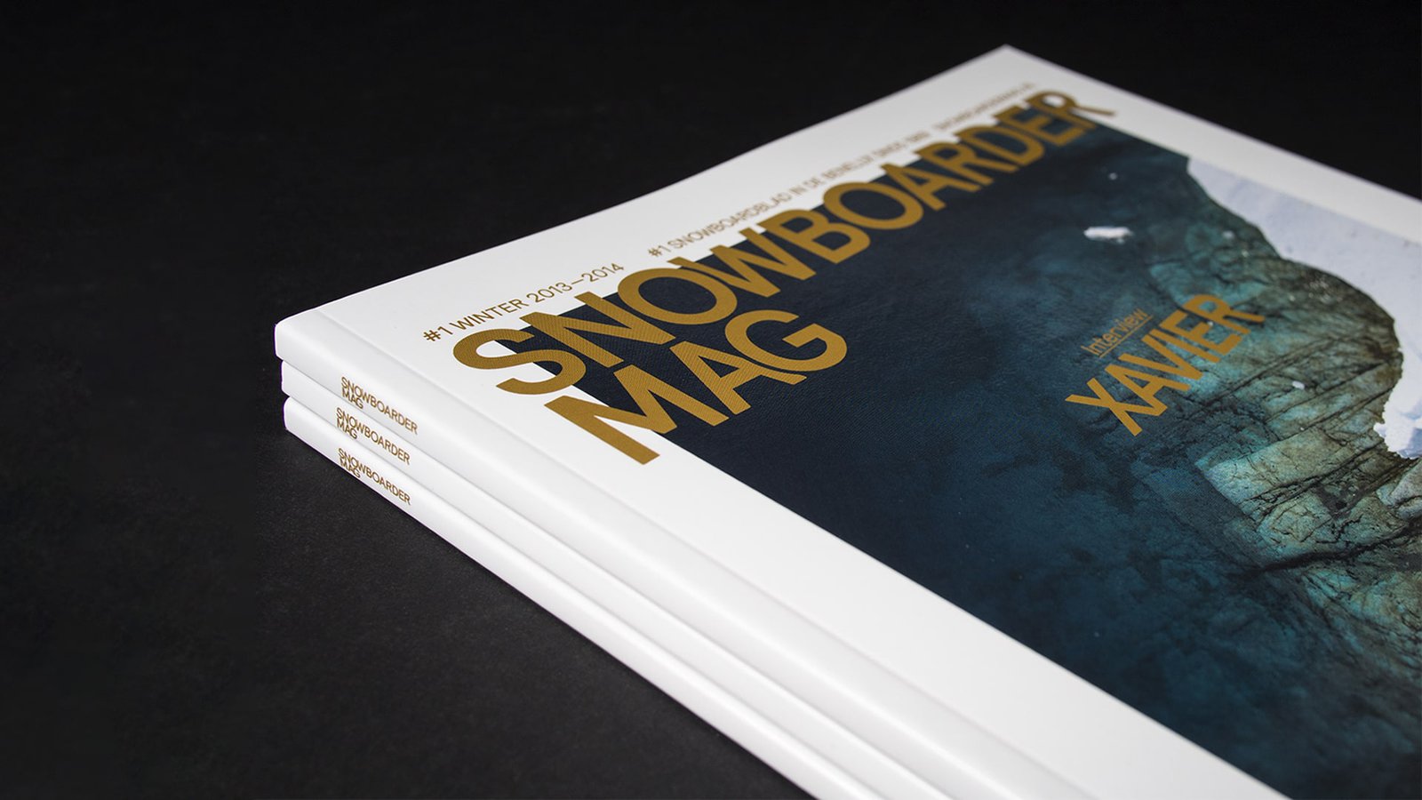
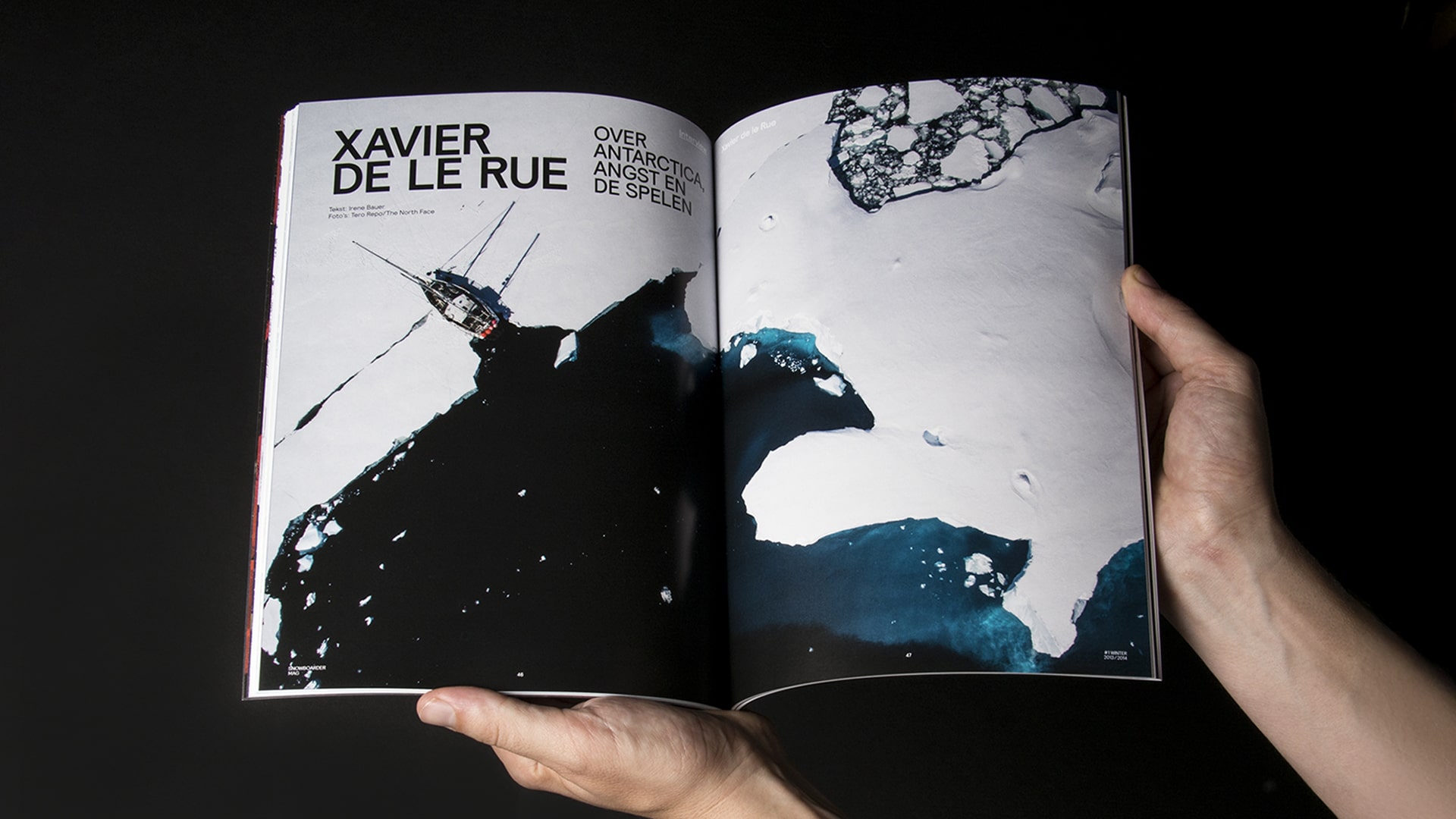
Redesigning Snowboarder Mag: A Fresh Ride for an Iconic Publication
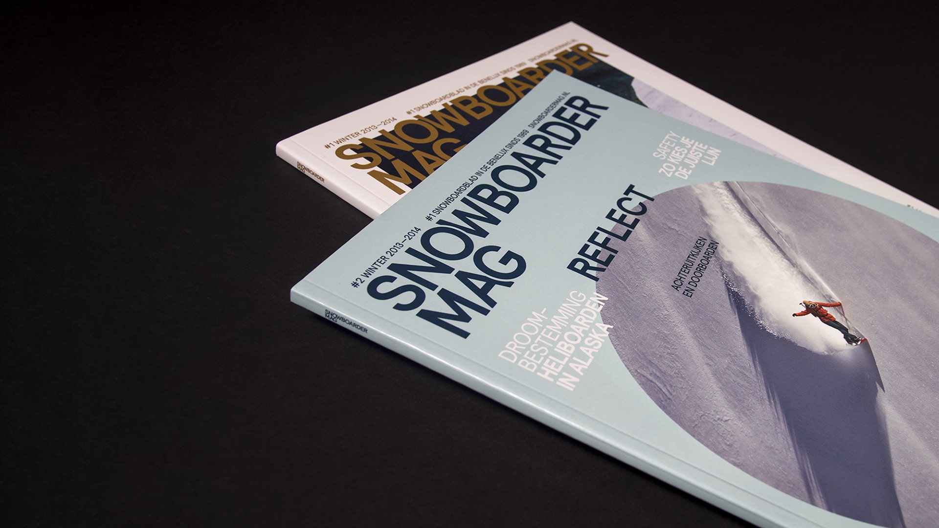
Snowboarder Magazine was the first publication dedicated to snowboarding culture in the Benelux, running since 1989. This project was completed by Studio Pino before our studio merged into Danki.
Read more
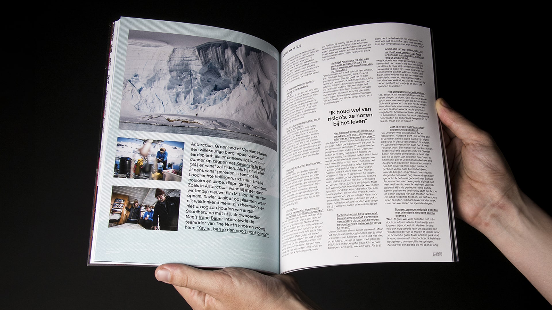
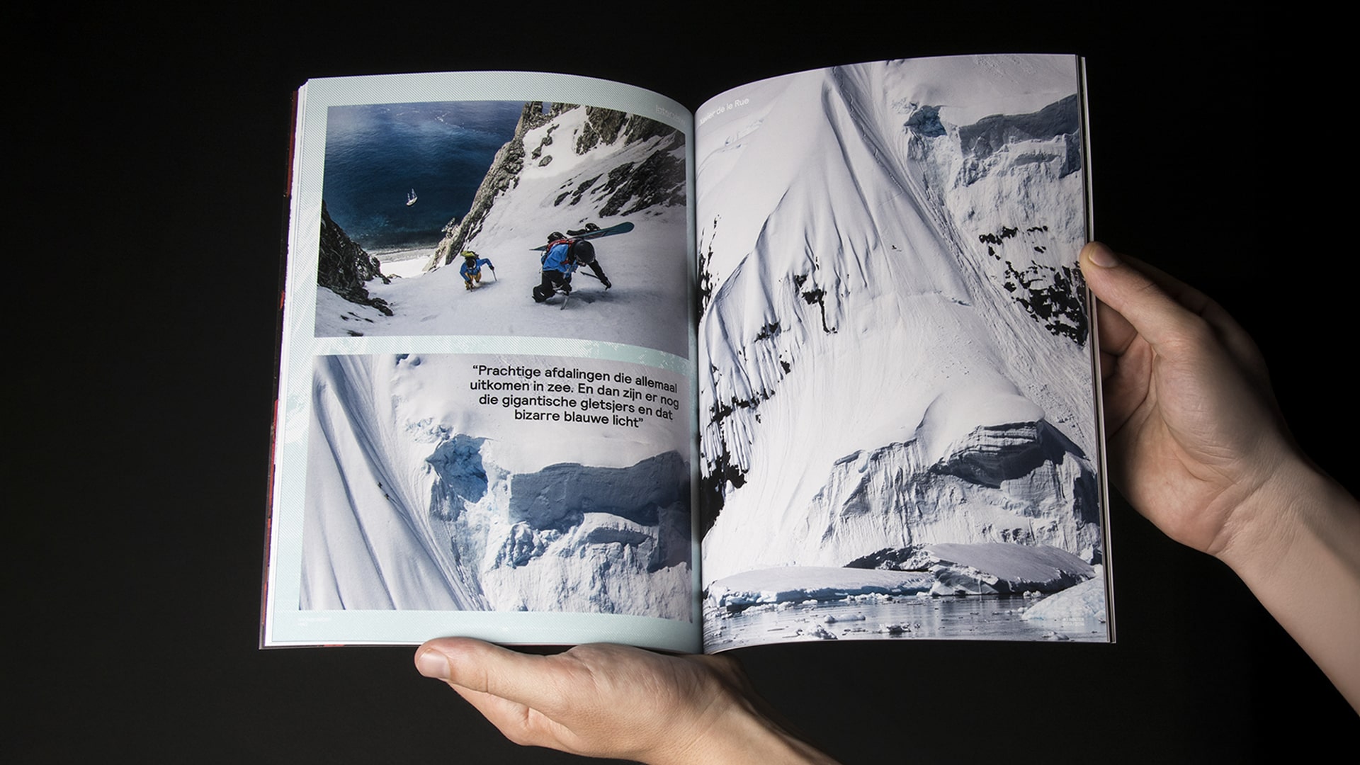
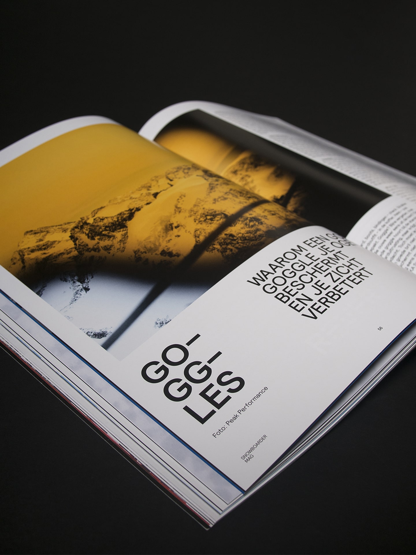
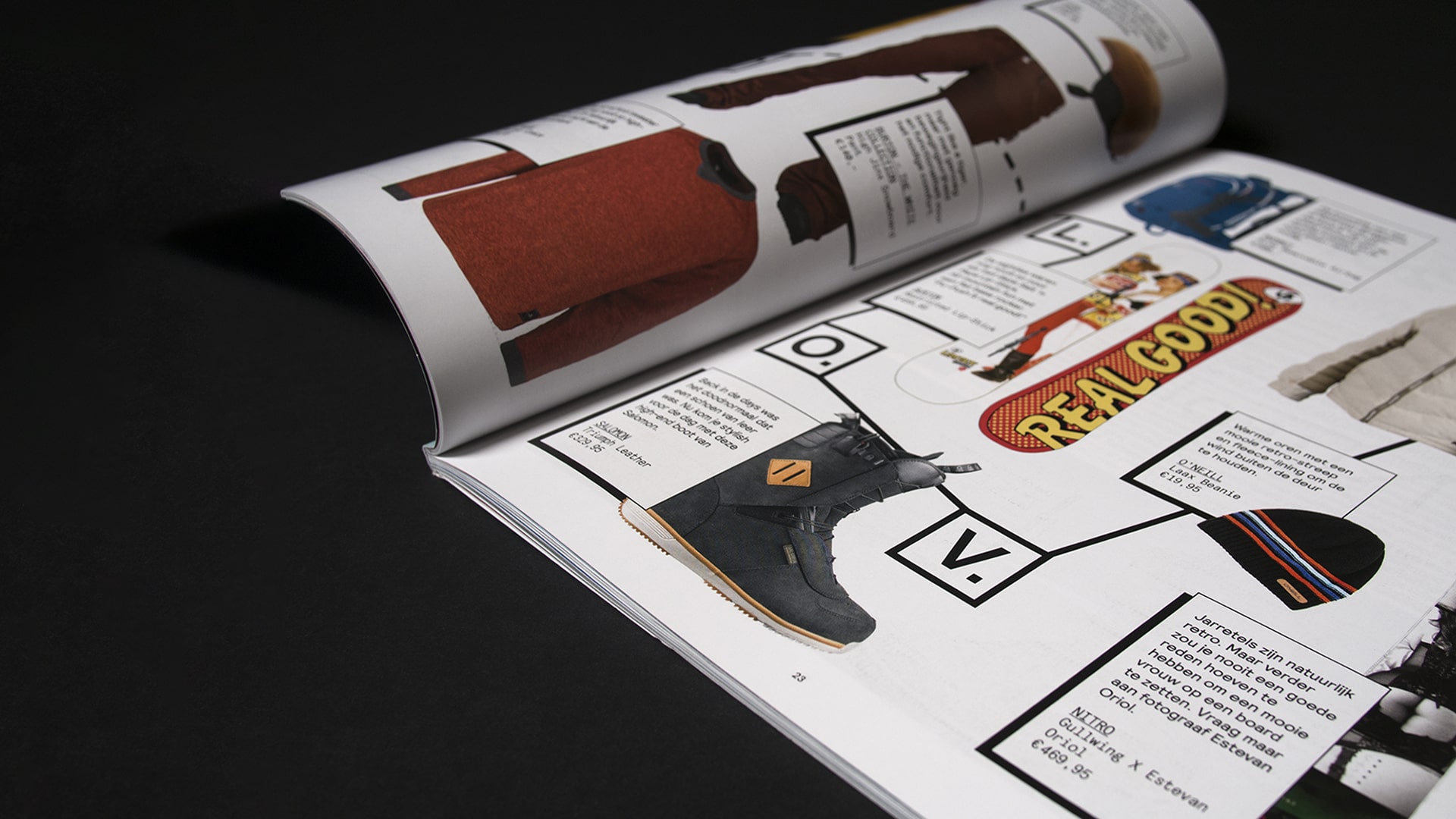
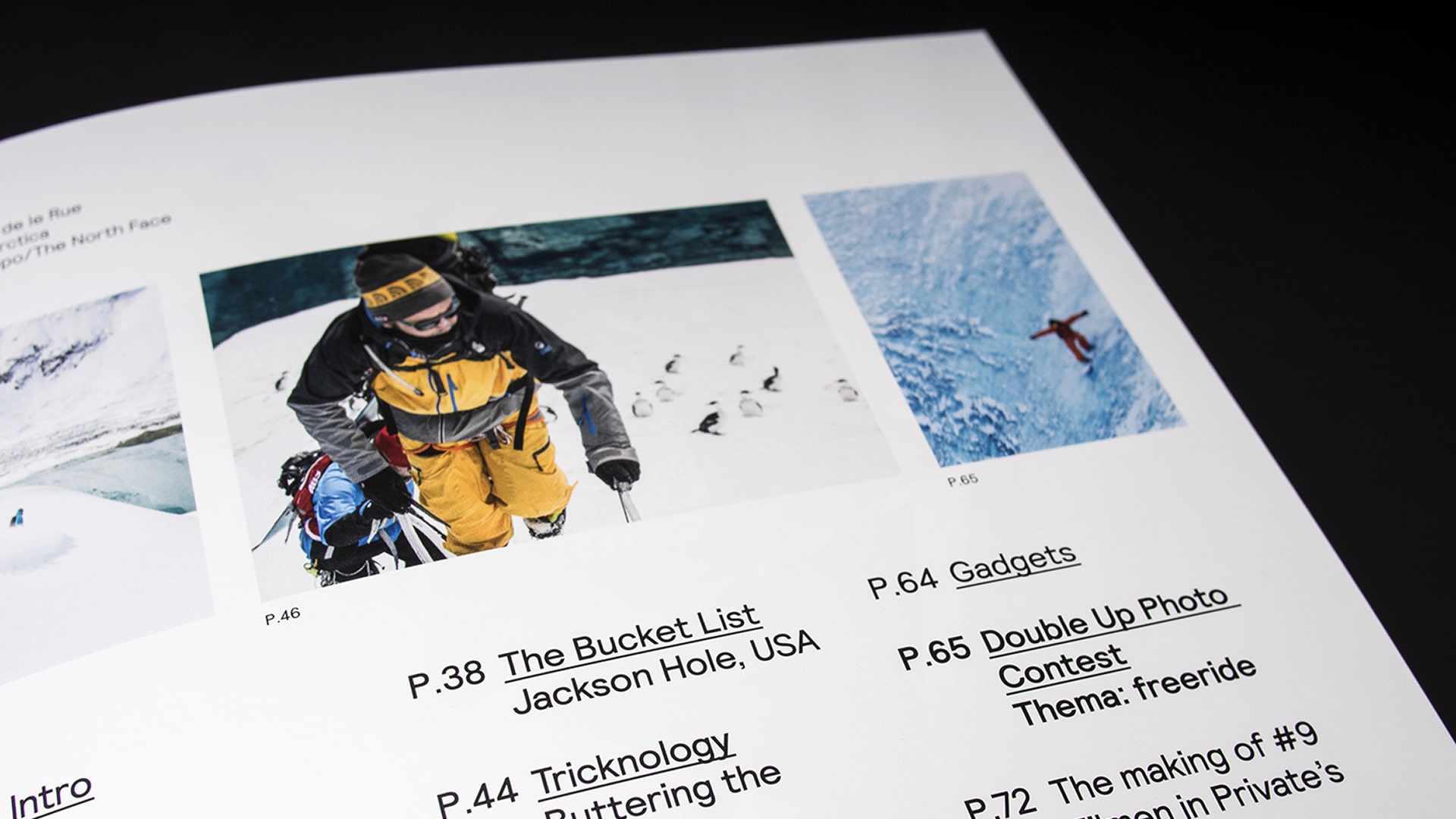
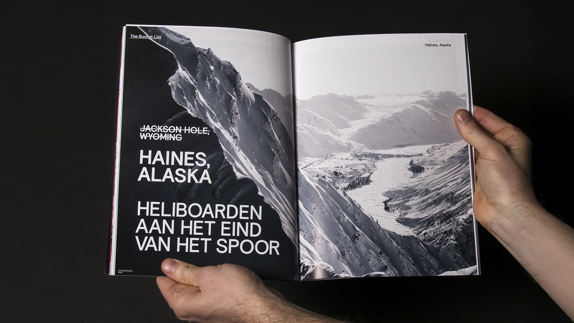
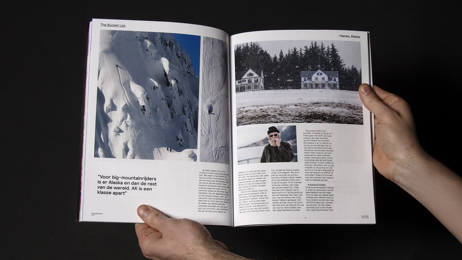
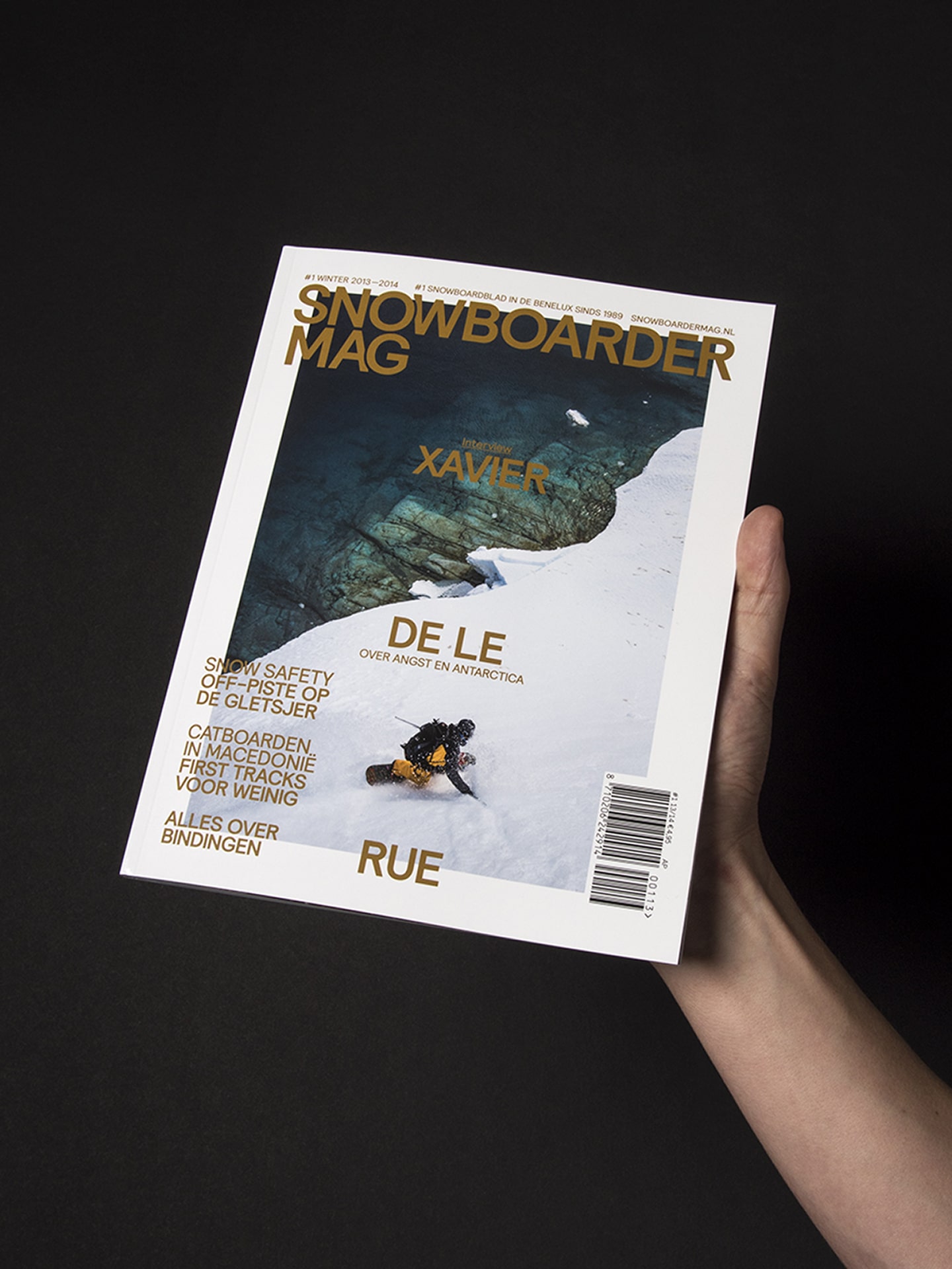
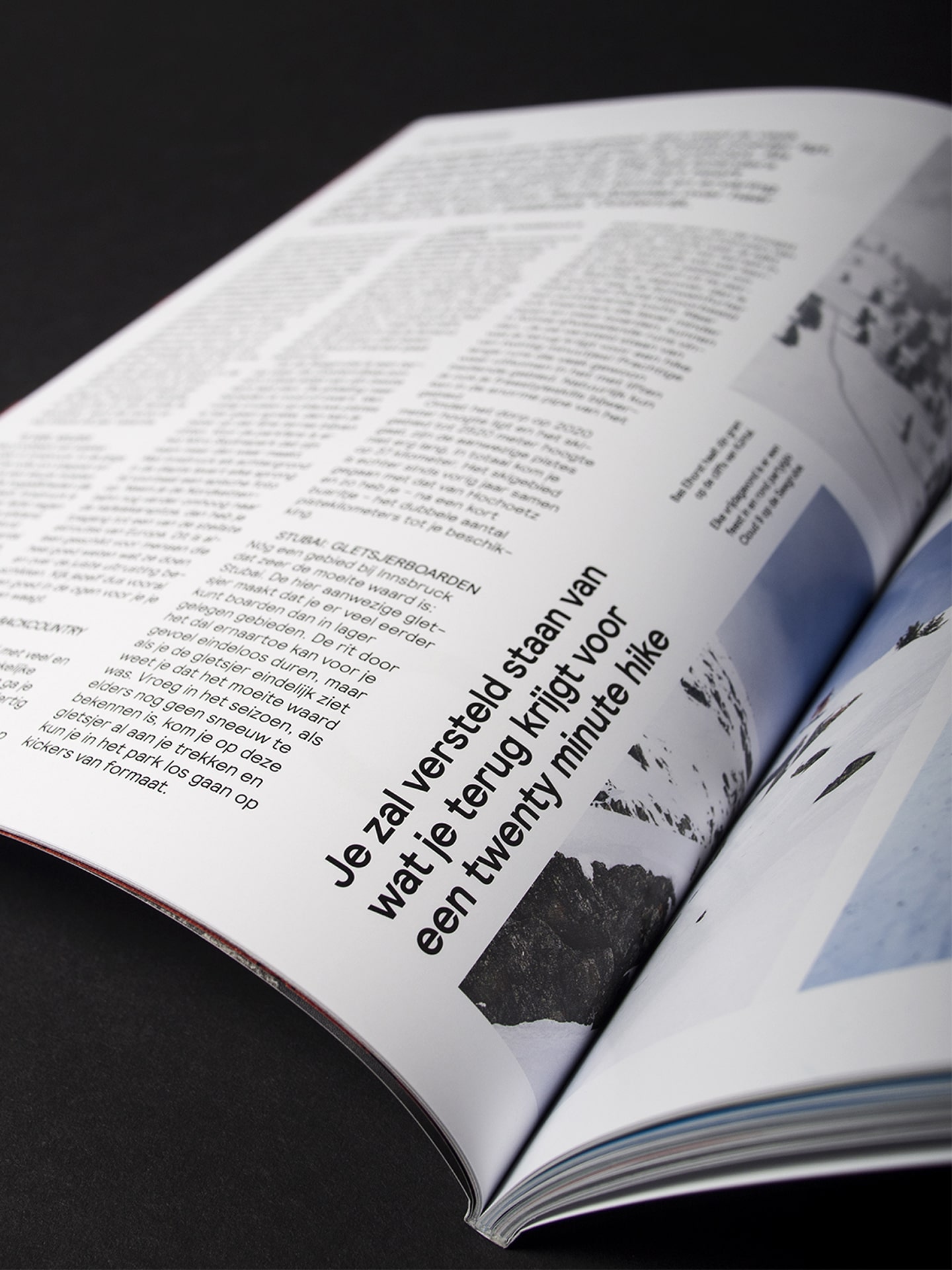
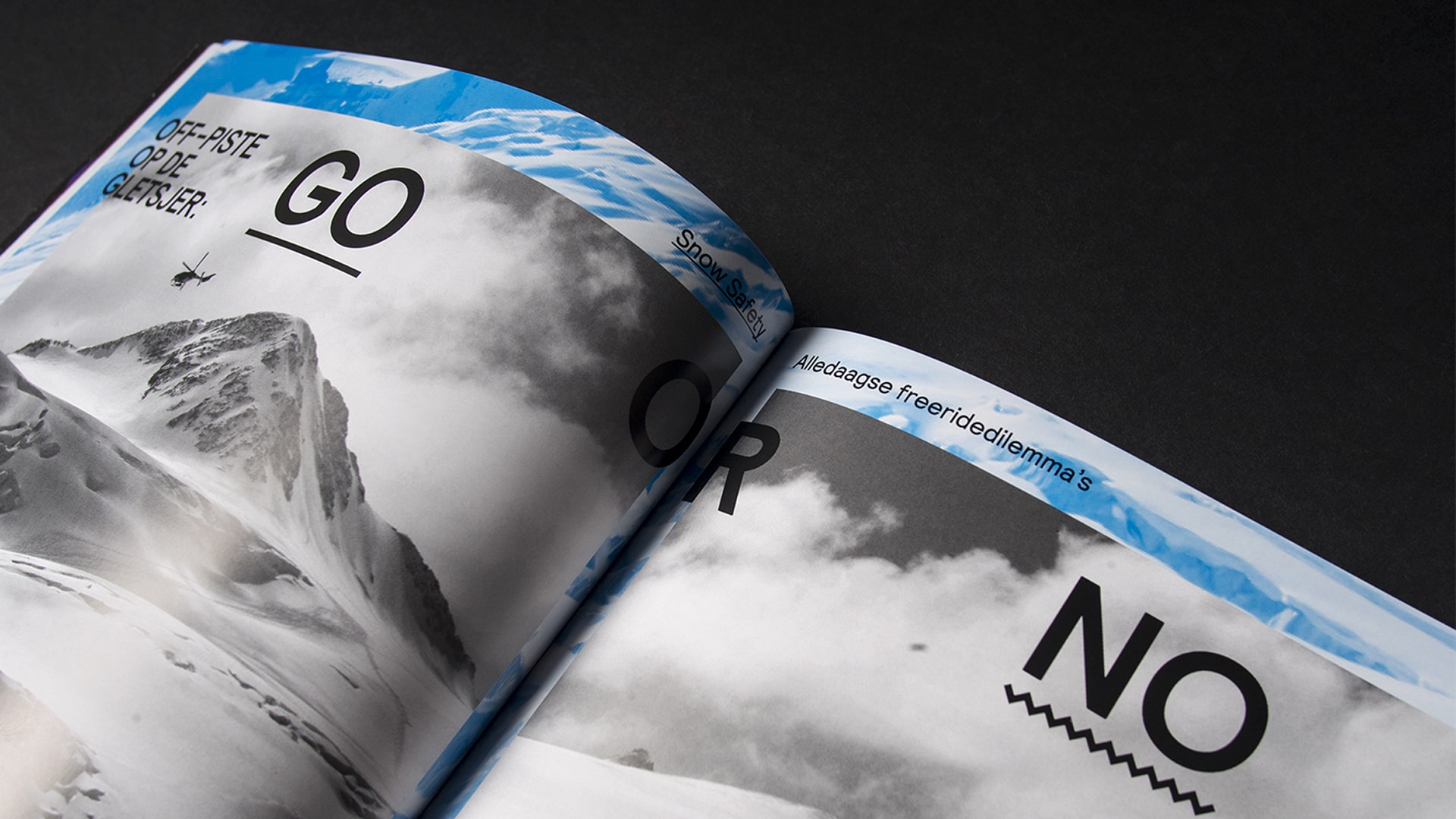
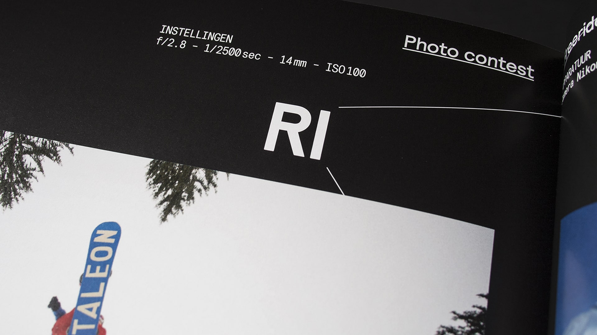
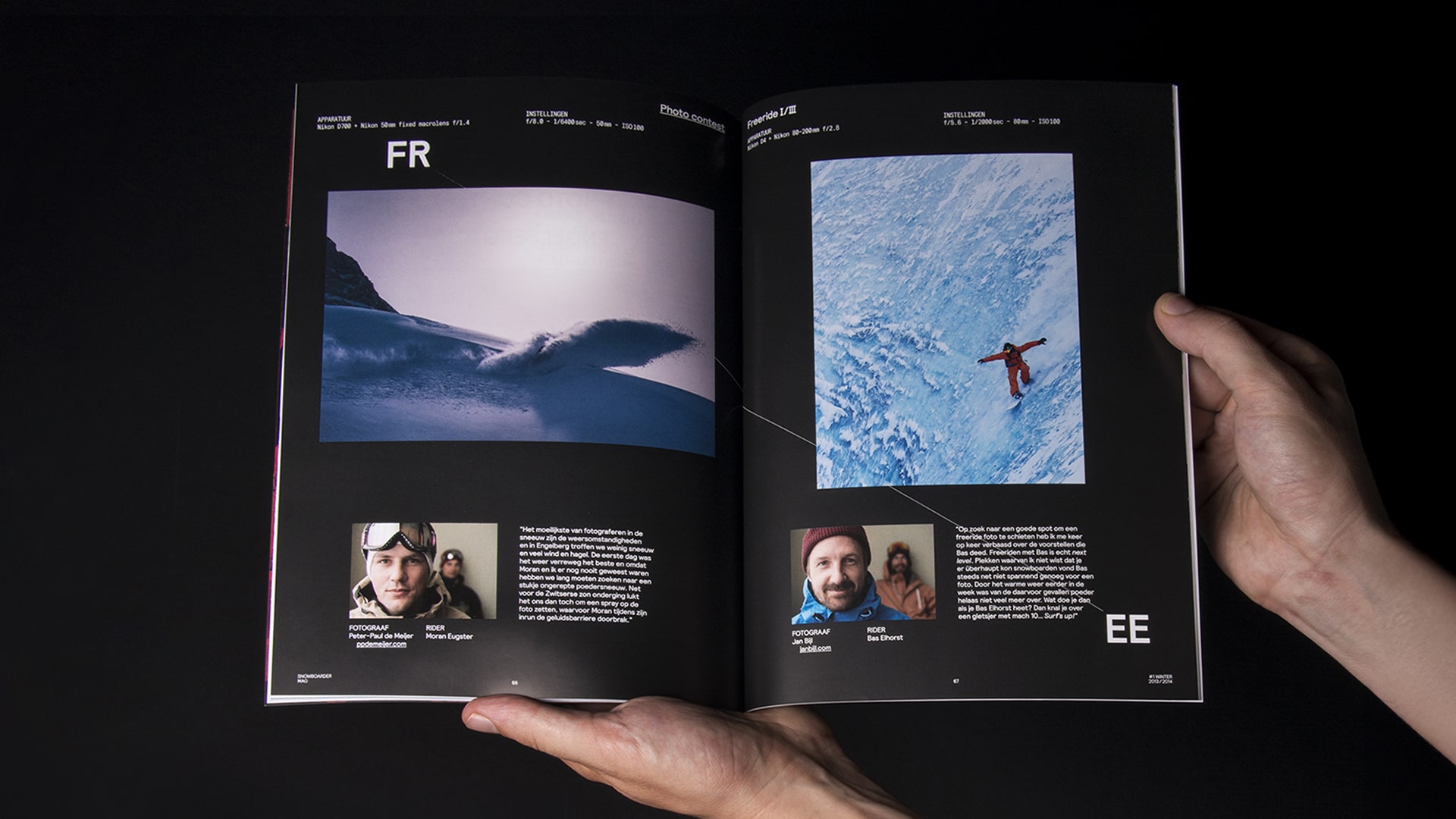
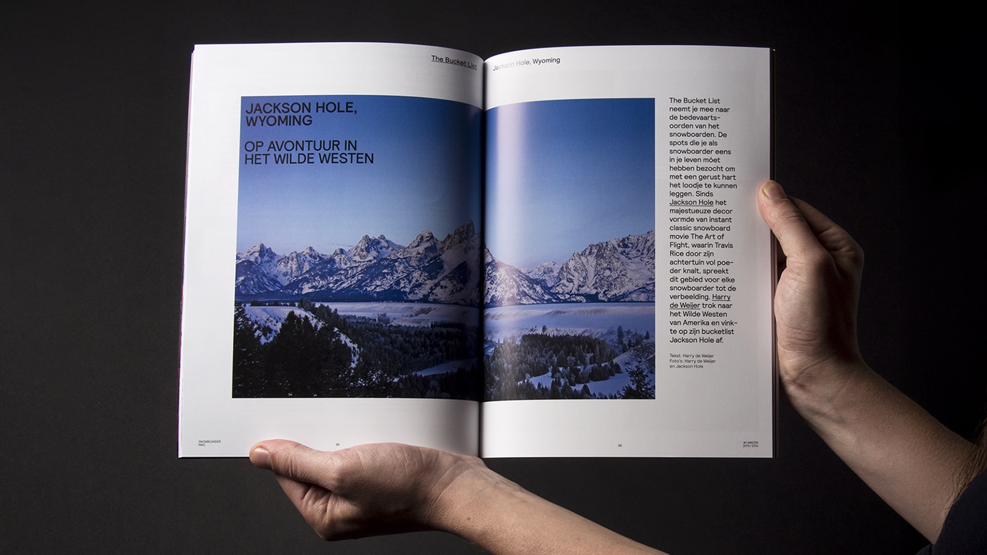
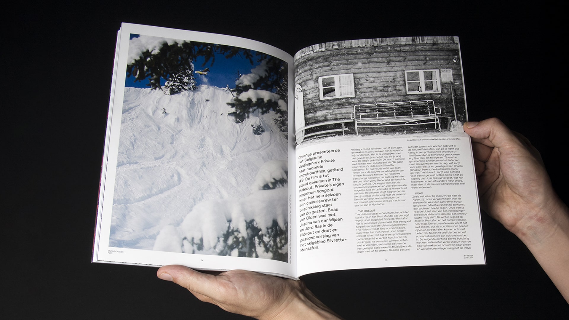
For this project, we reimagined Snowboarder Magazine with a dynamic, modern aesthetic that still feels fresh today. A key element of this was the use of the bold and unruly Relative typeface from Colophon Type Foundry, which helped breathe new life into the publication. Our approach involved playful typographical experiments and unexpected layout solutions, capturing the adrenaline-fueled, free-spirited essence of snowboarding. This redesign remains one of our all-time favorites, a perfect blend of form and function that has stood the test of time.
- Client: Maruba Sports & Lifestyle
- Brief: We were tasked with modernizing the visual identity of Snowboarder Magazine, infusing it with energy and a fresh, contemporary feel while remaining true to its roots in snowboarding culture.
- Output: A complete redesign of the magazine, including a new layout, typography, and visual style, making it feel modern, energetic, and true to the spirit of snowboarding.
-
Collaborators:
Stefan Altenburger
Want to tell us about your project?
Yes. Coffee please!You might also enjoy